
I
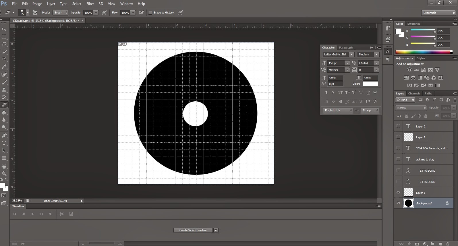
started out with sizing the circle. I decided to the photoshop grids in order to find the right measurements.


Afterwards, I decided to lay down the typography. To give the CD an interesting touch,
I decided to warp the text and make it appear less conventional.


It also seemed that warping the rest of the texts would make the CD appear less proffesional.
I did not want to exagerate with the effect so I decided to leave the rest of the text as it is.
For it to look like a "real" CD print, I also decided to put the logo of the record label, as well as
the text claiming ownership.

No comments:
Post a Comment