Wednesday, January 29, 2014

Magazine Advert (progress)


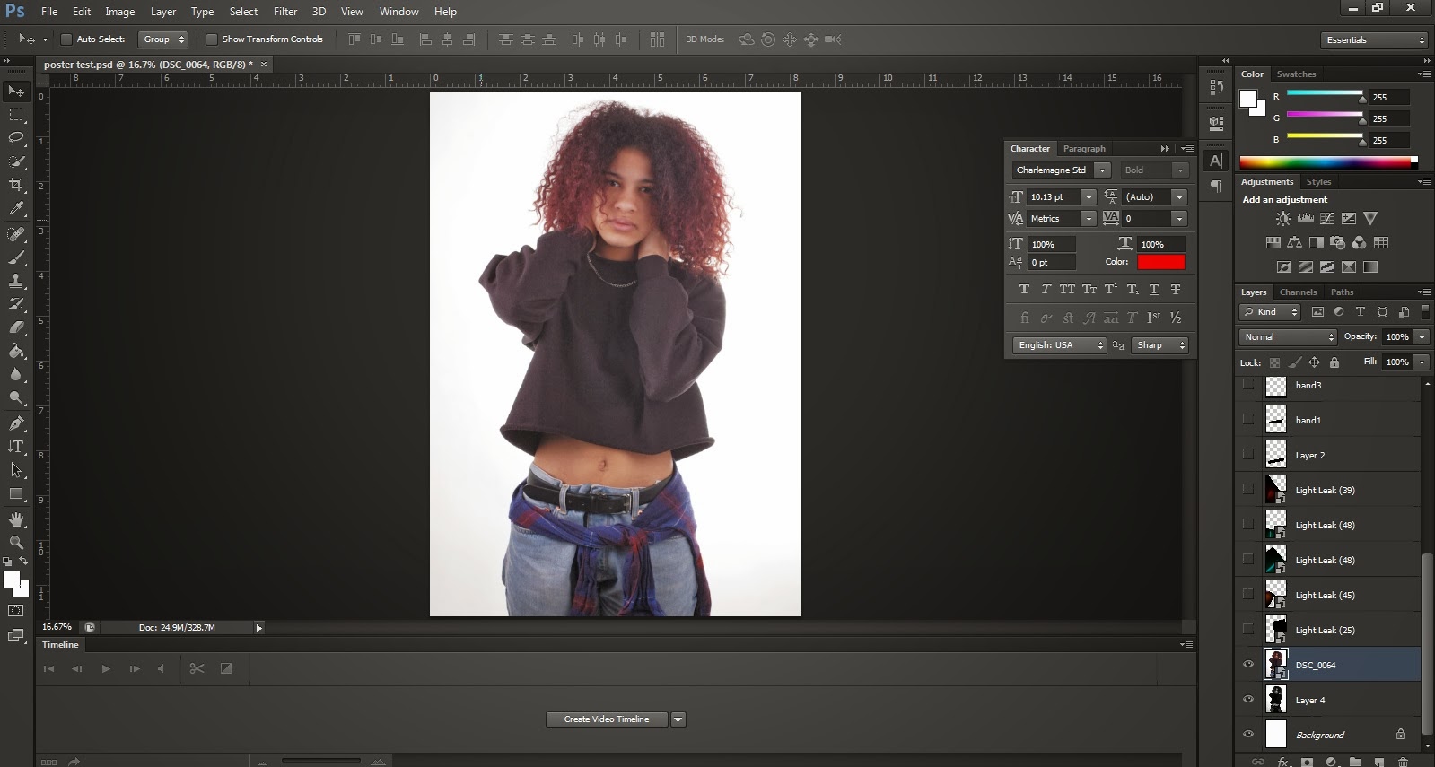
Although this is the magazine advert, I decided to that the picture should also be black and white, as it
would be less confusing for potential customers. The picture used is also a full size image of the one on the CD's  front cover, this ultimately creating synergy between the two products.


Again, suing curves helps with accentuating the hues of the picture.


Like on the extra page of the CD, I also decided to use different light leaks. Since the poster advertises the
product(CD), I felt that puting more colours would represent the genre of the artist. Pop music is extremely vibrant, and so I felt that the multitude of colours would show show this best.


A black band at the bottom of the picture felt that would benefit the poster. It also appears to be
the "norm" for various magazine adverts. I therefore decided to use it to incorporate the artists' website, 
the i-tunes logo advertising that the album will also be released in digital form, and the logo of the record label. 


Here, I decided to put the artist and album name on black strips. To give it an urban touch, I decided
to warp the black striped as give the image an "original" feel. 


Like on the extra page of the CD, I also decided to use different light leaks. Since the poster advertises the
product(CD), I felt that puting more colours would represent the genre of the artist. Pop music is extremely vibrant, and so I felt that the multitude of colours would show this best.


This is my first try. I really like the outcome, however, I feel that it is missing information, so I will try to 
incorporate the release date for a last touch.


As part of the process, I decided to add a new black stripe. However, the position doesn't seem to benefit the poster as it makes it appear too crowded.


In the end, increasing the stripe at the bottom appeared to work best. The poster has all the necessary information without feeling "crowded", whih gives it a more proffesional look. 


CD extra (progress)


Like in my previous edits, I also changed the colours to black and white in order to create
synergy with the covers of the CD. 


Since this is an extra addition to our CD, I decided to add the lyrics of the song, as it invites the 
customer to get more attached to the music of our artist.


I also decided to add more light streaks. This is because I wanted to give it a more colourful scheme without deviating too much from the front covers. As a result, the colours are soft and discreetly placed. 
   

CD design(progress)


I
 started out with sizing the circle. I decided to the photoshop grids in order to find the right measurements.


Afterwards, I decided to lay down the typography. To give the CD an interesting touch,
I decided to warp the text and make it appear less conventional. 


It also seemed that warping the rest of the texts would make the CD appear less proffesional.
I did not want to exagerate with the effect so I decided to leave the rest of the text as it is.
For it to look like a "real" CD print, I also decided to put the logo of the record label, as well as
the text claiming ownership. 


Tuesday, January 28, 2014

CD Back Cover(progress)


I started out with positioning the picture and turning it to black and white in order to create
synergy with the front cover .


However, I felt that the background gives the picture a "dirty effect". I therefore erased it for 
a better view. 


I also used curves in order to accentuate the colours. Although the picture is black and white,
to me, accentuating its hues seems to give it a more "proffesional" look. 


After finishing with the picture, I decided to lay out the typography. I also put
the logo of the record label as well as the bar code in order to make the CD
appear real. 


I decided that the credits were covering too much from the CD's space. I decided to change the font
to a smaller size -this making it appear more spacious.


Here, I wanted to experiement with other tpyes of light leaks. However, I realised that it does not create
synergy with the front cover, so I decided to change it.


As a result, thiscolour is  more similar to the ones used on the front cover, thus linking the two images together.


Front Cover (design progress)


I started with putting the image on photoshop and sizing it the way I felt most appropiate. 


After positioning the picture, I decided to change the colours to black and white in order
to make our artist look more urban and grungy.


I also experimented with purple hues, as I found the monochrome slightly dull.


Afterwards, I decided to use curves in order to accentuate the colours.


In the end, I felt that I should change the colour scheme once again, as it seemed that the purple is not very natural.


Afterwards, I decided to write the title of the album. I positioned it in the middle, as it seemed to work
with the rest of the picture.


For a last touch, I decided to use light leaks(pictures with glowing effects). To make them transparent, I changed their setup from "Normal" to Screen". 


However, I found this effect too powerful so I decided toc hange for something else.


For instance, I decided to combine two different light leaks. I found this effect more desirable, as the
colours are less powerful.


I also tried to change the layout, just in case I'd find a better way to position the
typography. However, I decided that I still prefer the first one I made.